Hi,
Is it possible to adjust the x-axis scale for the response time distribution charts?
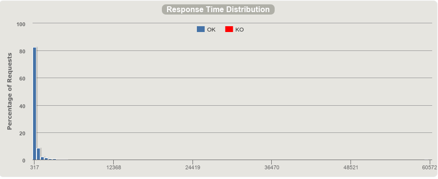
My problem is that most requests either get bucketed together within a very small range, and then have a very long tail, which makes it hard to grasp the distribution shape.
Here’s an example of what I mean:
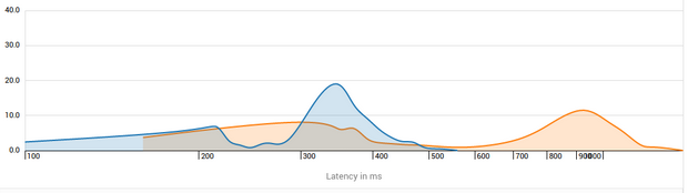
I would like to be able to adjust the binwidth as minimum, or perhaps even use something like density plot like Google’s Cloud Trace
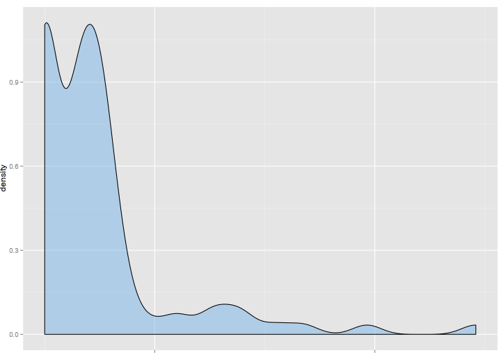
or like in R with ggplot2, where I used the same data from Gatling, which tells me whole different story compared to Gatling’s Histogram.
Thanks for you great work!
– Carlos Torres