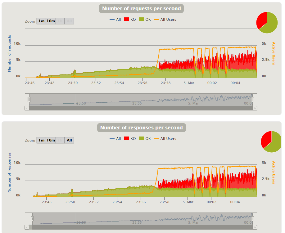
I am doing a simple group which consist of 8 html file requests. What is the difference between the OK requests/sec chart and the OK response/sec chart?
I mean when doing an http request, it is successful if the response is received, but for some reason there are slight differences between the two charts.
Requests take time. You might initiate 100 requests this second. Half of them might finish this second, while others finish in the next, while some might take several seconds. As long as you are doing a lot of simple sub-second requests, the two graphs should be largely (but not exactly) identical.
But suppose something in the test system gets backed up, and so requests are starting to queue up but not being fulfilled right away. In that case, the two might get out of sync for a time. Having both graphs lets you see and be able to understand better what is happening at the server.
So a KO request refers to an error (example to many open files) and a KO response is a timeout error for example? Cause I am still not understanding the diff. between a successful request and successful response?
Sorry for the inconvenience but it is really important to me to understand this. Thank you
No no. I know that. I am just saying based on Stéphane LANDELLE description whether a KO in the response graph is the same as a KO in the request graph? I mean a KO in the request graphs represent an error related to making the request such as too many open files while an error in the response graph refers to an error coming from the system under test (i.e. the one that should send the response)?
What I’m saying is that the source of the data is the same. A KO is a KO. The difference between the graphs is NOT the number of transactions or how they failed, only when you plot them. Whether you plot them based on time the transaction was initiated, or when it was completed.